Pages

Thursday, September 30, 2010

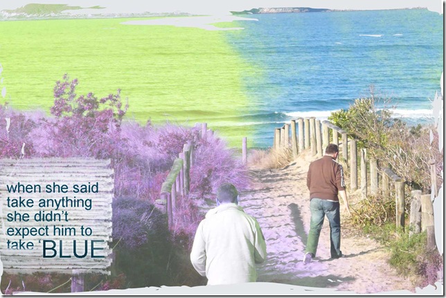
well that was uncalled for

hopefully this one will make you laugh, after the rather poignant one earlier in the week.

prompt-uncalled-for-took-bl

The prompt on Inspiration Avenue was ‘uncalled for’ and I decided to push the idea and have some fun.  Probably influenced by recent discussion of Jasper Fforde’s novel about a colour dominated world.

Monday, September 27, 2010

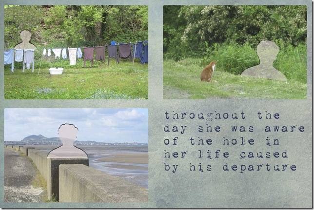
prompted by nothing !

Madeline at Sunday Creative is really pushing us this week with the prompt word of ‘nothing’.

Often with these prompts my first spark of an idea is the technique within Photoshop Elements that relates to the technique.  At other times the first spark is a particular photo that I have or will take to use.

This time the two sparked into my brain together, pretty fast.  The technique is the ability to cut any shape from a photo and the subject was that my younger nephew left home to go to University earlier this month and everyone is missing him.  So here is what I did

creative-sunday-prompt-noth

Saturday, September 25, 2010

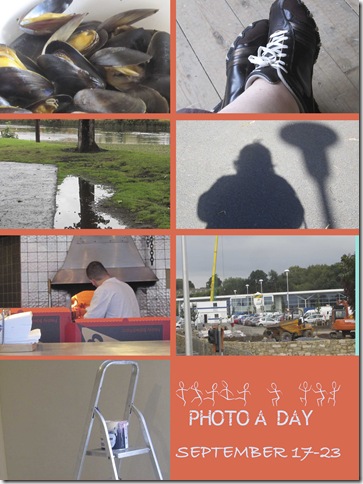
photo a day week 38

Only 14 more weeks – hard to believe.

I seem rather focussed on dinner and the weather this week.

photo-a-day-38

1. steamed mussels for dinner

2. new walking shoes

3. interesting reflections in the puddles

4. enough sun for shadows

5. woodfired pizza for dinner

6. construction of the new local supermarket

7. more walls are painted

Friday, September 24, 2010

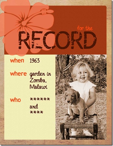
wonderful old photo

A photo of me, aged one, with my new puppy appeared in the local newspaper at the time (not sure why).  I now have a digital scan of the photo which I used in a simple ‘for the record’ format. I haven’t included the names in this version because these details are often part of the security questions asked for online secure logins. 

I like the basic format for some of the key older photos – easy to change the colours and the element in top left, and then just add the basic facts.  I adapted the ‘awesome’ template from Cathy Z.

for-the-record-pet-web

[Hibiscus created using the hibiscus font;  record is in rub this font, other writing is in fineliner script font.  Background is a texture from ShadowHouse Creations.  Design started with Cathy Z layered template.]

The colours and element were inspired by the ARTastic monthly challenge which uses a famous artwork as the starting point – this month it is Frida Kahlo’s Self Portrait with Monkey.

Wednesday, September 22, 2010

saved for a rainy day

Sunday was rather grey and overcast so I made some digi layouts – just for me, just for fun, using some of the photos I’ve taken this month.  Kept to my normal simple style.  I did try some pattern paper on them but really I much prefer plain colour.
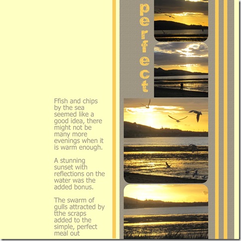
perfect-sunset

Layered template from Design House Digital TNT collection.  Font in the title is orial, journaling is tahoma.

Just noticed the tt in the journaling – will have to live with it, I don’t keep the psd file of digi pages.

tools-of-the-trade

Layered template by Katie Pertiet at Designer Digitals.  Fonts in title quadranta is the main one and fineliner the other.

Journaling reads

Each job needs different tools, multiple, not just one.

The big cupboard in the living room is full of tools, all 4 shelves and the floor. And the ones only used sometimes are in the shed.

When the renovation is over, these shelves will be transformed into the dresser. Can’t imagine it yet - it is still tool central.

[The paint colours in the bottom photo are my bedroom]

Monday, September 20, 2010

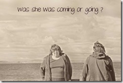
coming or going?

decide-2

Oh the magic of Photoshop.  I’ve seen several of these pictures around blogland – the same person appearing more than once in the photo.

Out on my walk today I used the timer to take several pairs of photos.  Then back on the computer put one photo on top of the other and used the eraser tool to remove part of one photo so that the other showed through underneath.

On this one I then applied the Pioneer Woman action called heartland – because the colours were distracting from the duality focus.

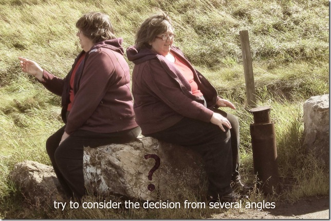
decide-3

This one I created in the same way. Sitting on the stone made it easier to ensure that in the two photos I was taking up different parts of the canvass.  On the next pair of photos I didn’t manage to position myself in different places so I had to use a different technique – cutting myself out of one photo and placing in the other.  This method is much harder in terms of getting relative position and size correct.

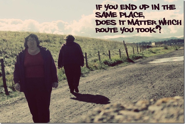
decide-1

On this one I applied the Pioneer Woman’s action called seventies.

These were fun. Setting up the pair of photos was harder than doing the photoshop magic to meld them.  I will definitely play with this some more.

These were prompted by the Inspiration Avenue prompt this week of decide.

Sunday, September 19, 2010

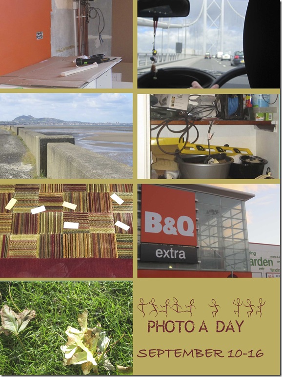
photo a day week 37

Some progress on my renovation and I did get outside too.

photo-a-day-37

1. progress on the kitchen (yes I chose orange for the walls)

2. driving over the Forth Road Bridge taking my nephew to University

3. walk by the firth

4. my tool shelves – eventually this will be the dresser in my living room

5. rug for the living room, with paint possibilities scattered over it

6. weekly trip to B&Q for DIY stuff

7. leaves are falling – autumn is here

Friday, September 17, 2010

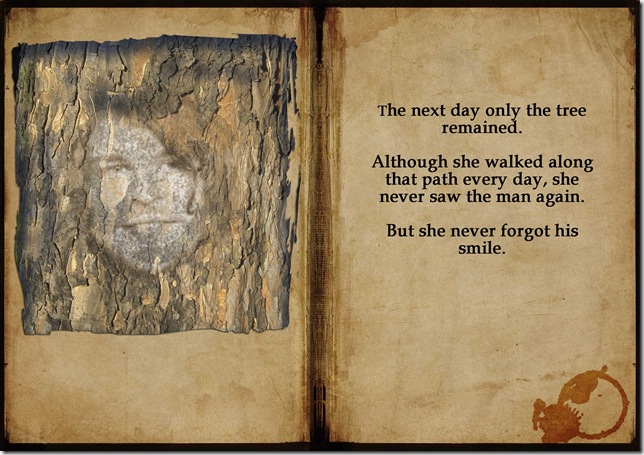
metamorphosis


finn-metamorphis

Prompted by Inspiration Avenue to be mysterious.  The prompt was metamorphosis so I decided to play with layers and erasing in Photoshop Elements.  The face is my nephew who loves being dramatic so will enjoy this image.

Book background from ShadowHouse Creations.  Wine stain is a dingbat font called Cafeina.  The main font in Book Antiqua.

Tuesday, September 14, 2010

is it really comfortable?

Had fun this evening playing on Photoshop Elements responding to some prompts.  I really do see this as distinct from the ‘memory keeping’ things, even though I also do them on the computer at the moment.

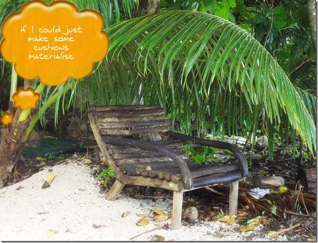
The one word prompt from Creative Sunday was ‘comfort’ and here is what I did.

comfort

I took the photo last year on a small island off the main island in Vanuatu (in the Pacific Ocean).  It looked idyllic but wooden logs are not that comfortable to sit on.

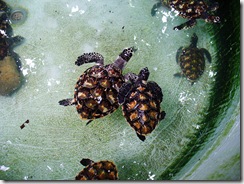
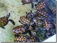
The main reason we visited the island was to see a turtle nursery – so especially for Deb, here are 2 photos of the babies.

turtles-one

turtles-two

Monday, September 13, 2010

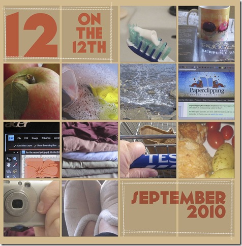
12 on 12th closeup

I haven’t done 12 on the 12th for over six months, but yesterday I remembered early in the day.  I decided to take close-ups of details.

12-on-12th

As the photos show it was a normal Sunday – read my novel,did some washing up,had a walk, did some photoshop elements, put away some summer clothes, went to the supermarket.  A nice snapshot of the everyday.

On the mosaic the font is geomancy and the stitches are from scruffy stitches set by Amy Hutchison at After Five Designs.

Sunday, September 12, 2010

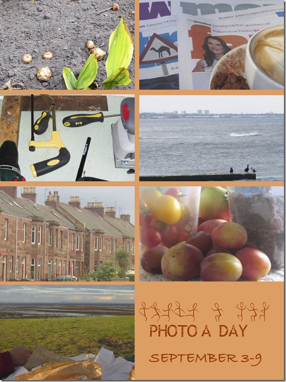
photo a day week 36

photo-a-day-36

a real mix, this week, of close up and vista

1. planting lots of bulbs

2. Saturday papers and coffee

3. the tools for putting up shelves

4. cormorants and a windy sea

5. view from the living room

6. produce from my parents – plums, apples, toms and brownies

7. fish and chips by the sea at dusk

Monday, September 6, 2010

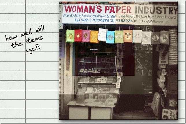
how well would it age?

how often have you been looking at goods in a shop and wondered how well the items will wear.  Wouldn’t it be great if we have a handy gadget that could give us a peek at how they age.

how-willl-they-age-web

This idea was where I went with the Sunday Creative prompt of ‘time worn’.   The shop in the photo is in Kathmandu, Nepal – it is piled high with lovely paper notebooks, lampshades, albums etc.

I used actions in PSE to create the different ‘ages’ – all from Pioneer Woman they are , left to right ‘Fresh Color’, ‘Seventies’, ‘Heartland’ and ‘Vintage’.  Interesting progression that I’m going to try on some other photos.

The paper is from Design House digital – JenAllyson 365 Journal paper 6.  The staple is from klund.  The font is j.d.

Sunday, September 5, 2010

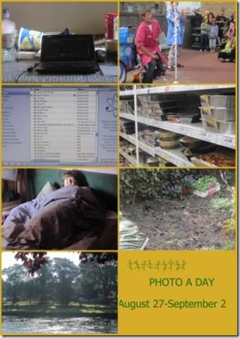
Photo a day week 35

Some everyday, some one-off related to that day.  Thinking about the daily photo really is a natural part of my daily routine now.

photo a day35

1. where I do all my online stuff at the moment

2. science fun at the busking festival (packet of mentos in a bottle of lemonade)

3. creating new playlists on ITunes

4. what to have for dinner? the prepared meal section of Tesco

5. in bed, (recreated, I admit)

6. garden weeded and ready for some planting

7. sunshine on the river

Wednesday, September 1, 2010

how illuminating

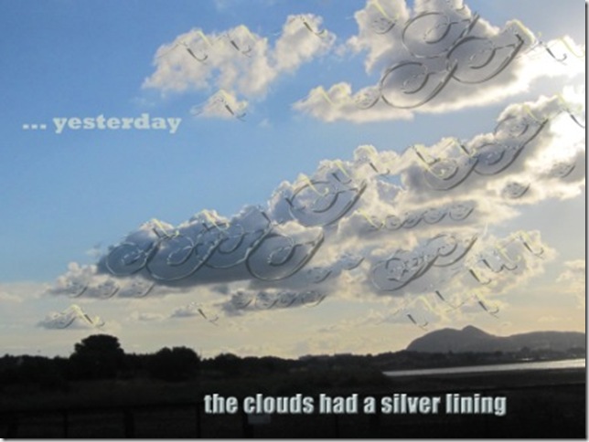
more playing with the tools inside Photoshop Elements – this time prompted by the weekly word prompt over at The Sunday Creative.

The word this week is illuminate, which has several nuanced meanings including ‘to decorate with designs or pictures in gold or colours’

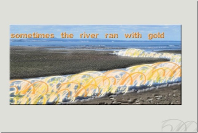
So I played with adding a filigree effect using the Large Deco Brushes from Brusheezy.  I also played with layer effects and opacity as I added each layer of shapes.

That was so much fun that I did another one, using the same brushes set and techniques and added some bevel to the sand.

illuminate river

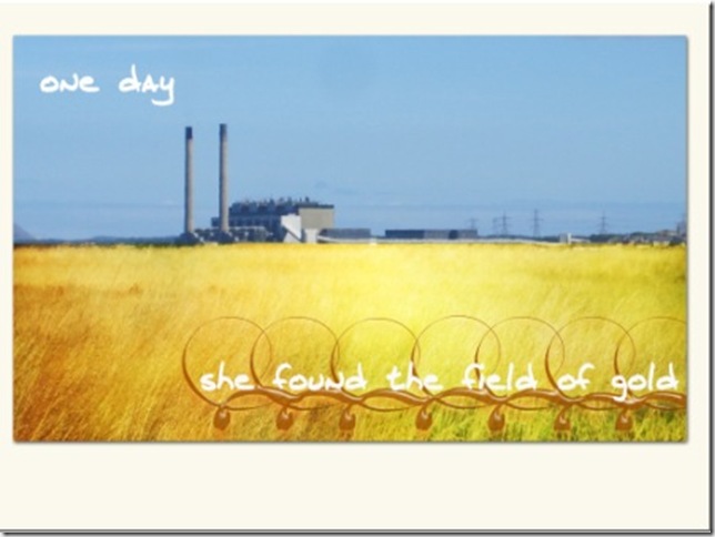
And then I decided to try using some textures from ShadowHouse Creations which looked like gold – I used square textures 66 & 67 and the overly effect.

illuminate field

Taken near my house looking towards the power station. And here is the original just to prove we do not really have fields that colour.

aug 30 (8)

Hope you now feel illuminated, in some way.